Tokens Studio
Transforming a design tooling MVP into a scalable product platform
As Product Designer, I redesigned the web app interface, built the design system from scratch, and created a new visual identity — work that helped the product evolve from a fragmented MVP toward a more cohesive experience ahead of its public launch, including self-serve onboarding and subscription flows.
- Role
- Product Designer
- Scope
- Web AppDesign SystemVisual IdentityGrowth
- Team
- 2 DesignersDevelopersStakeholders
- Duration
- 1 year (2024-2025)
Context
Token Studio is a design tooling product that helps teams manage and synchronize design tokens across design and development workflows. Originally launched as a Figma plugin, it grew to over 300K users and became widely adopted among design system teams.
B2B SaaS
Business Model
300K+
Users
Design Tooling
Category
As the product evolved, the team began expanding beyond the plugin by introducing a web-based application designed to support more complex and platform-agnostic workflows.
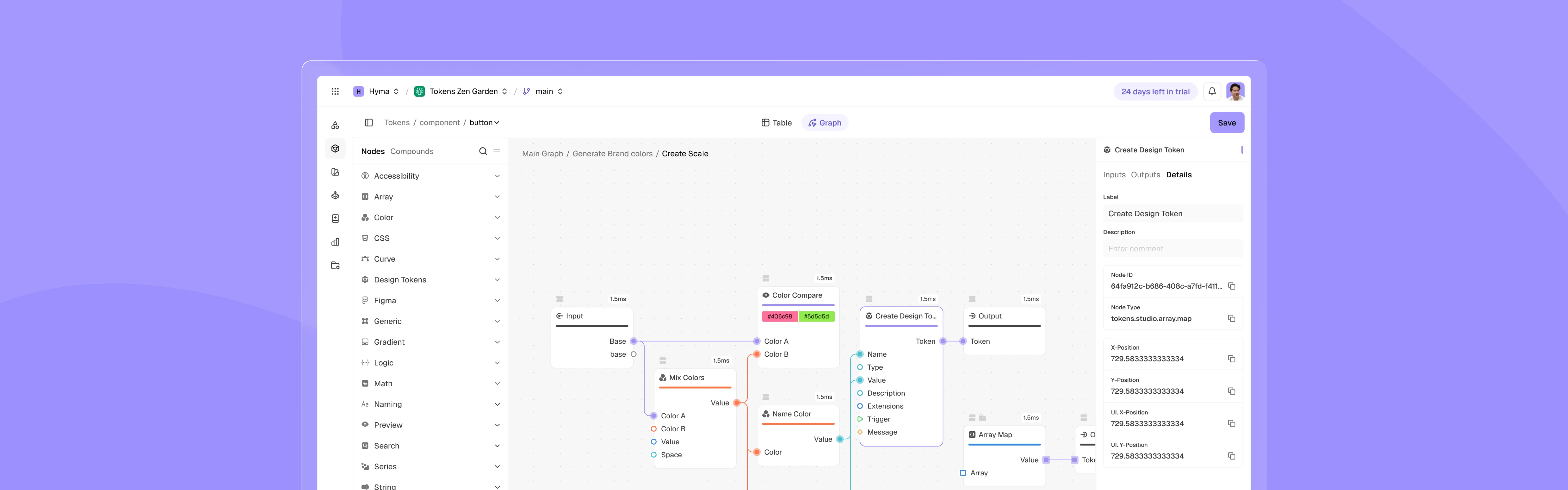
The platform introduced a node-based system that allowed users to build dynamic token logic, while also acting as a central source of truth where tokens could be managed and distributed across multiple environments - including design tools like Figma, Sketch, and Penpot, as well as codebases for web, iOS, and Android.
At the time, the web app existed as an early MVP and was tested with a limited group of users to validate its potential. The product served a wide range of users, from individual designers and developers to design teams and enterprise companies.
My Role
I worked as a Product Designer focused on the design system, visual identity, and key product flows — including onboarding, subscription, and plugin integration — as the product evolved from an early MVP toward launch.
My responsibilities included:
- 1Defining the structure and UX of core product flows
- 2Designing end-to-end user flows, including onboarding and subscription
- 3Translating complex system logic into usable product interactions
- 4Building and documenting the Figma design system
- 5Developing the product’s visual identity
- 6Plugin experience and upgrade flows
Product and brand direction were shaped collaboratively; I owned the execution of specific deliverables and regularly aligned with designers, engineers, and stakeholders.
While working on the design system and core product areas, I regularly validated decisions with engineers and stakeholders to ensure feasibility and consistency across the platform.
I also partnered with another designer on the visual direction and key flows such as onboarding and navigation.
Challenges
Tokens Studio had grown quickly from a plugin into a broader product. As the team expanded beyond Figma into a web platform, the product’s capabilities increased significantly, introducing more powerful and complex features.
This led to a few key challenges:
Product fragmentation and complexity
Users struggled to navigate and understand the product due to disconnected flows, growing complexity, and inconsistency.
Growth & adoption gaps
Users who were not involved in community were unaware of the web platform, as there was no communication about it inside the Figma plugin.
This directly affected user trust, decision-making, and conversion. My goal was to bring structure to the product, resolve key UX and system issues, and prepare a solid foundation for a future public launch.
Discovery
To better understand key product problems and limitations, I:
- Conducted a UX audit of both the plugin and the web app
- Analyzed user behavior insights shared via Mixpanel and internal discussions
- Reviewed and mapped existing user flows and upgrade paths
- Explored competitor products and navigation patterns
- Collaborated closely with engineers and stakeholders to identify recurring user issues
This discovery revealed several key issues impacting user experience, product adoption, and scalability.
Insights & Findings
1. Visual identity not yet aligned with the product direction
To understand how the brand was perceived across the product, I conducted a brand audit across all key touchpoints.
This revealed the following:
- Visual identity guidelines and a shared visual system were still to be established
- Product value and messaging could be communicated more clearly
- Product perceived as a niche tool for technical users
- Need to reposition for a wider audience beyond early adopters
While analyzing existing visual identity assets, I found inconsistent typography usage, 3-4 different fonts were used across product surfaces.
The vertical balance between the symbol and wordmark was off, making the logo harder to use, especially in tight layouts or alongside text.
No consistent visual system across marketing assets. Visual styles varied from post to post, making the visual identity feel fragmented and less recognizable.
While analyzing existing visual identity assets, I found inconsistent typography usage, 3-4 different fonts were used across product surfaces.
The vertical balance between the symbol and wordmark was off, making the logo harder to use, especially in tight layouts or alongside text.
No consistent visual system across marketing assets. Visual styles varied from post to post, making the visual identity feel fragmented and less recognizable.
Based on this analysis, I identified the following key insight:
Insight #1
The product's positioning wasn't yet clearly defined, which made its value harder to grasp and limited activation beyond a technical niche.
2. Design system and workflow needed a foundation
To understand how the product was built and maintained, I conducted a design and workflow audit across Figma files and the existing codebase.
This revealed the following:
- The web app lived primarily in code, so design work often happened on top of screenshots
- Design files in Figma were still to be structured
- There wasn't yet a single source of truth between design and development
- The design system in Figma was still to be built; components existed mainly in code with varied styling
Core UI elements lacked consistency in styling, spacing, hierarchy, and iconography, making the product feel fragmented across different surfaces.
The product primarily existed in code, without a design source of truth to work from.
Rapid growth and fast iteration had outpaced file structure, making it hard to find the latest designs or flows.
Core UI elements lacked consistency in styling, spacing, hierarchy, and iconography, making the product feel fragmented across different surfaces.
The product primarily existed in code, without a design source of truth to work from.
Rapid growth and fast iteration had outpaced file structure, making it hard to find the latest designs or flows.
Based on this analysis, I identified the following key insight:
Insight #2
Without a unified design and development system yet in place, workflows were fragmented, which slowed scaling and affected UI consistency.
3. Key user flows still needed for launch
To evaluate the readiness of core user flows for a successful launch, I conducted a UX audit across key product surfaces and mapped existing user journeys to identify gaps and inconsistencies.
This revealed the following:
- Authentication and account flows were still to be built
- Onboarding and self-serve entry points weren't yet in place
- Billing and subscription flows were still to be added
- Project management flows could be expanded
Authentication and onboarding flows were incomplete. There was no SSO, invitation flow for joining existing organizations, or proper subscription onboarding before entering the product.
Subscription and billing management did not exist inside the product. Users had to contact support manually to activate, change, or manage their plans.
Authentication and onboarding flows were incomplete. There was no SSO, invitation flow for joining existing organizations, or proper subscription onboarding before entering the product.
Subscription and billing management did not exist inside the product. Users had to contact support manually to activate, change, or manage their plans.
Based on this analysis, I identified the following key insight:
Insight #3
Several core user flows were still to be completed before launch, which was key to helping users reach value moments.
4. Low visibility of the web platform inside the plugin
To understand how the web platform was integrated into the user journey, I analyzed key plugin surfaces, entry points, and upgrade paths, along with available usage insights shared by the team.
This revealed the following:
- The web app had limited visibility inside the plugin
- The transition from plugin to platform wasn't yet clear
- Many users weren't yet aware of the platform
- The updated pricing model could be communicated more clearly inside the plugin
The web platform was barely visible inside the plugin, hidden deep in settings and difficult for most Figma users to discover.
Paid features were surfaced without proper explanation or onboarding. Unclear upgrade paths created confusion between the plugin, pricing model, and platform offering.
The web platform was barely visible inside the plugin, hidden deep in settings and difficult for most Figma users to discover.
Paid features were surfaced without proper explanation or onboarding. Unclear upgrade paths created confusion between the plugin, pricing model, and platform offering.
Based on this analysis, I identified the following key insight:
Insight #4
The web platform had limited visibility in the user journey, with room to improve awareness, adoption, and conversion.
Solutions
Based on these insights, I worked on a set of design solutions across visual identity, design system, product flows, and the plugin.
This case study shows design work produced during my involvement. Implementation varied across deliverables, and some concepts were later revised or replaced by the team.
Solution #1
I redefined the visual identity to communicate the product's value more clearly and broaden its appeal beyond a technical audience.
This included:
- A new typography system and display typeface aligned with the visual identity
- A refined logo aligned with the new visual direction
- A complete visual language system, including colors, shapes, and illustration style
- Clear visual identity guidelines enabling consistent use across digital and print materials
- Marketing templates for scalable content production
- A foundation for future product UI and marketing experiences
Together with CCO Marcel van Zwieten, we selected Almarena Neue as the display typeface to reflect the brand’s bold, vibrant, and playful personality.
This typeface has cutouts that visually rhyme with our symbol and help express that design systems can feel playful and approachable.
I updated the wordmark using Almarena Neue and fixed the alignment issues between the symbol and the wordmark mentioned earlier.
The symbol was refined to improve readability at smaller sizes and create better visual balance with the updated wordmark.
The symbol and wordmark were rebuilt on a pixel grid to improve consistency, sharper rendering, and cleaner anti-aliasing at smaller sizes.
I introduced bright and vibrant accent colors to reflect the diversity and flexibility of design tokens while giving the visual identity a more energetic and expressive character.
To support the brand’s bright and vibrant tone of voice, I introduced a tone-on-tone color strategy that keeps visuals expressive while maintaining color harmony.
For decorative and background elements, I created a flexible set of abstract shapes inspired by the idea of diversity, modularity, and platform-agnostic design systems.
For the illustration style, I chose a neo-brutalist direction to make the visuals feel bold, vibrant, and playful.
This bento composition shows how the updated logo, typography, color palette, and visual language work together.
The updated website introduced a more playful and expressive visual direction while making the platform feel clearer.
I designed a series of promotional ads to communicate Tokens Studio’s core value in a more recognizable way.
I redesigned the YouTube channel covers and thumbnails to align content with the new visual identity.
Our CCO Marcel van Zwieten launched a community swag campaign ahead of the web app release, featuring stickers illustrated by Brazilian artist Murillo Cleto.
I designed a new cover for the Tokens Studio plugin in the Figma Community, aligning it with the refreshed visual identity and product positioning.
Together with CCO Marcel van Zwieten, we selected Almarena Neue as the display typeface to reflect the brand’s bold, vibrant, and playful personality.
This typeface has cutouts that visually rhyme with our symbol and help express that design systems can feel playful and approachable.
I updated the wordmark using Almarena Neue and fixed the alignment issues between the symbol and the wordmark mentioned earlier.
The symbol was refined to improve readability at smaller sizes and create better visual balance with the updated wordmark.
The symbol and wordmark were rebuilt on a pixel grid to improve consistency, sharper rendering, and cleaner anti-aliasing at smaller sizes.
I introduced bright and vibrant accent colors to reflect the diversity and flexibility of design tokens while giving the visual identity a more energetic and expressive character.
To support the brand’s bright and vibrant tone of voice, I introduced a tone-on-tone color strategy that keeps visuals expressive while maintaining color harmony.
For decorative and background elements, I created a flexible set of abstract shapes inspired by the idea of diversity, modularity, and platform-agnostic design systems.
For the illustration style, I chose a neo-brutalist direction to make the visuals feel bold, vibrant, and playful.
This bento composition shows how the updated logo, typography, color palette, and visual language work together.
The updated website introduced a more playful and expressive visual direction while making the platform feel clearer.
I designed a series of promotional ads to communicate Tokens Studio’s core value in a more recognizable way.
I redesigned the YouTube channel covers and thumbnails to align content with the new visual identity.
Our CCO Marcel van Zwieten launched a community swag campaign ahead of the web app release, featuring stickers illustrated by Brazilian artist Murillo Cleto.
I designed a new cover for the Tokens Studio plugin in the Figma Community, aligning it with the refreshed visual identity and product positioning.
The new direction moved away from a generic developer-tool aesthetic toward a more expressive and modern identity, making the product feel more accessible while still appealing to technical users.
Solution #2
I organized the Figma workspace and built the design system to bring more consistency and structure to how design and development worked together.
This included:
- A structured Figma workspace with clearly organized projects for marketing, product, and design system assets
- Defined file architecture and ownership, making it clear where assets, flows, and components live
- A centralized design system in Figma, including components, icons, and foundational styles
- Token-based foundations and variables, enabling scalable and consistent styling across the product
- Integration between Figma and code via Tokens Studio and Storybook
I reorganized the Figma workspace into separated projects to make collaboration faster and easier. This structure became the foundation for scaling both the product and DS work.
Color-coded covers and clear naming conventions made it much easier for the team to quickly find and recognize files.
Together with Marco Krenn, we built a scalable foundation system powered by Tokens Studio and synchronized between Figma variables, code, and the web platform.
After establishing the foundations, I built a scalable design system with more than 48 documented components.
Components, icons, and tokens were connected across design and development, helping keep implementation aligned with the source of truth.
I reorganized the Figma workspace into separated projects to make collaboration faster and easier. This structure became the foundation for scaling both the product and DS work.
Color-coded covers and clear naming conventions made it much easier for the team to quickly find and recognize files.
Together with Marco Krenn, we built a scalable foundation system powered by Tokens Studio and synchronized between Figma variables, code, and the web platform.
After establishing the foundations, I built a scalable design system with more than 48 documented components.
Components, icons, and tokens were connected across design and development, helping keep implementation aligned with the source of truth.
This shifted the workflow from disconnected, screenshot-based design to a structured and scalable system where design and development were aligned.
Solution #3
In collaboration with another designer Chaithanya Reddy, I helped define and implement core user flows required for a successful product launch, enabling users to access key functionality and reach value moments.
This included:
- Authentication and account flows, including sign up, sign in, organization management, and access recovery
- Onboarding and self-serve entry points, enabling new users to start using the product without manual setup
- Billing and subscription flows, allowing users to manage plans, upgrades, and payments
- Core product flows for project and token management
- Updated navigation structure, improving clarity and accessibility across the application
- High-fidelity UI flows built on top of the new design system
A new modern and refreshed UI direction that reflects the updated visual identity, tone of voice, and overall product vision.
I audited existing product surfaces to define the scope of redesign and prioritize missing flows.
Together with Chaithanya Reddy, we explored multiple redesign directions before selecting and expanding one visual direction across the product’s core surfaces.
Core product surfaces were redesigned with a cleaner visual language, updated UX patterns, and stronger alignment with the new design system and visual identity.
After the main surfaces were established, we designed the missing flows required for launch - authentication, onboarding, billing, subscription management, and project/user management.
A complete authentication experience was introduced, including sign up, sign in, invitation flows, and onboarding entry points.
We designed self-serve billing and subscription flows, allowing users to manage plans, upgrades, payments, add-ons, and organization members.
A new modern and refreshed UI direction that reflects the updated visual identity, tone of voice, and overall product vision.
I audited existing product surfaces to define the scope of redesign and prioritize missing flows.
Together with Chaithanya Reddy, we explored multiple redesign directions before selecting and expanding one visual direction across the product’s core surfaces.
Core product surfaces were redesigned with a cleaner visual language, updated UX patterns, and stronger alignment with the new design system and visual identity.
After the main surfaces were established, we designed the missing flows required for launch - authentication, onboarding, billing, subscription management, and project/user management.
A complete authentication experience was introduced, including sign up, sign in, invitation flows, and onboarding entry points.
We designed self-serve billing and subscription flows, allowing users to manage plans, upgrades, payments, add-ons, and organization members.
This helped move the product from a fragmented experience toward a more usable and self-serve platform, ready for public launch and better able to support activation and retention.
Solution #4
I designed in-plugin upgrade flows and monetization touchpoints to make the web platform visible and drive adoption.
This included:
- In-plugin pricing and plan management, allowing users to view, compare, and upgrade without leaving the plugin
- Clear plan structure communication, explaining the difference between plugin-only and platform-enabled tiers
- Contextual upgrade entry points across the plugin
- Feature education flows to communicate the value of advanced capabilities
- Promotional banners and lifecycle messaging to drive timely conversions
- Platform awareness touchpoints introducing the web app and encouraging users to start a free trial
I analyzed the existing plugin experience and found limited visibility into paid plans, platform features, and the new web app, with few upgrade or monetization touchpoints in place.
I created a complete upgrade funnel inside the plugin, introducing plan awareness, upgrade trajectories, and contextual entry points that connected the plugin experience with the new web platform.
I introduced a new Subscription section inside the plugin, where users could discover the updated pricing model, explore new plans, platform features and manage their account.
I designed dynamic lifecycle banners tied to trial status, feature usage, and subscription state, creating clearer upgrade prompts and more visible monetization touchpoints throughout the plugin.
I designed contextual upgrade flows and educational carousels that explained premium features, increased feature awareness, and encouraged upgrades directly inside the plugin.
To make advanced features easier to understand, I designed short self-explanatory animations and interactive walkthroughs directly inside the plugin experience.
I analyzed the existing plugin experience and found limited visibility into paid plans, platform features, and the new web app, with few upgrade or monetization touchpoints in place.
I created a complete upgrade funnel inside the plugin, introducing plan awareness, upgrade trajectories, and contextual entry points that connected the plugin experience with the new web platform.
I introduced a new Subscription section inside the plugin, where users could discover the updated pricing model, explore new plans, platform features and manage their account.
I designed dynamic lifecycle banners tied to trial status, feature usage, and subscription state, creating clearer upgrade prompts and more visible monetization touchpoints throughout the plugin.
I designed contextual upgrade flows and educational carousels that explained premium features, increased feature awareness, and encouraged upgrades directly inside the plugin.
To make advanced features easier to understand, I designed short self-explanatory animations and interactive walkthroughs directly inside the plugin experience.
These designs aimed to make the platform more visible inside the plugin and give users clearer upgrade paths.
Outcome
My contribution included design deliverables across the visual identity, design system, core product flows, and plugin experience.
Structured and usable product experience
My contribution included the design of core user flows and navigation, along with a Figma design system that brought more structure and consistency to the design work.
The design system, documented components, and organized workspace provided a clearer foundation for collaboration between design and development.
Clearer plugin and platform connection
My plugin work included designs for clearer pricing, plan information, and upgrade paths directly inside the plugin.
These touchpoints were designed to clarify the relationship between the plugin and the web app and make relevant platform features easier to discover.
As broader company context, Tokens Studio surpassed 325,000 total users and, at one point, reported adding around 500 new users per day. These figures describe the product’s overall growth and are not attributed to the design work shown in this case study.
Reflection
A few key lessons from this experience:
A design system only delivers value when it's adopted
Building a design system is only half the work; supporting adoption and making it useful in everyday workflows is the other half.
In early-stage products, clarity doesn’t exist - you create it
Ambiguity is part of the process. Instead of waiting for direction, I learned to define structure, ownership, and priorities myself.
Speed without alignment creates long-term complexity
Shipping fast helped us move forward, but without a shared system it introduced inconsistencies and technical/design debt over time.
Product success starts with market fit, not perfection
Early-stage products can succeed even with imperfect UX if they deliver real value. But without a solid foundation, scaling that success becomes difficult.
Balance assumptions with real user feedback
Validating assumptions with user feedback throughout the process helps focus on the right problems sooner.